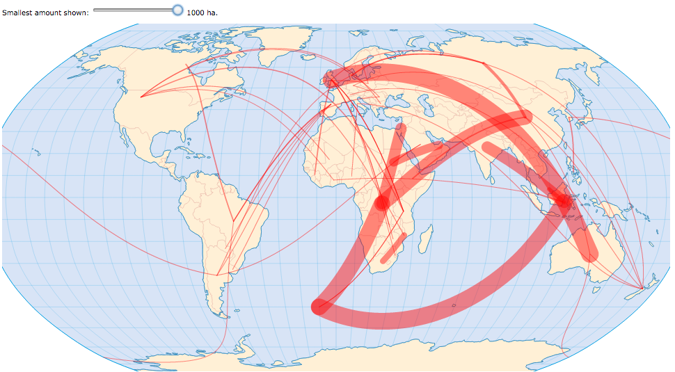
In the MAP the spatial context is explicitly clear. But the amounts of (especially the smaller) deals are difficult to estimate. This becomes even harder when more than just the top few deals are shown...
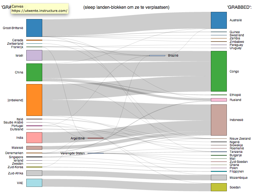
The FLOWCHART (or Sankey-diagram) is easiest to read, even the smallest deals are distinguishable, expecially with the interactivity of moving the country blocks around. It is also the only depiction that shows the few countries that are both 'grabber' and 'grabbed'... But the spatial dimension is totally lost to the user.
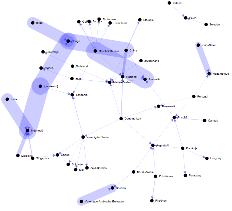
The NETWORK graph is flexible and interactive, but it is difficult to see who's a "grabber" and who is "grabbed". Furthermore, many users interpret the positions of the country dots and their relative distances as relevant, but in such a diagram these have no meaning (it's a purely 'topological' depiction)...
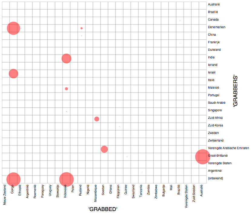
The MATRIX in theory serves well to show relations, but in this case the big difference between highest and lowest values makes it impossible to distinguish any but the largest instances, if we use the visual variable SIZE (as the theory tells us to use for such data on an absolute ratio measurement scale)... This can be improved by using the visual variable VALUE instead of size.