[id: 83]
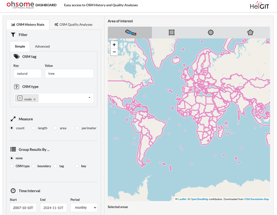
Short description: This thesis explores how users interact with a map-based dashboard, namely the ohsome dashboard (https://dashboard.ohsome.org/). The primary focus will be on understanding the sequence of actions users take and how their attention flows between dashboard elements. The findings could inform best practices for designing intuitive map-based dashboards that align with natural user workflows.
Keywords: Volunteered Geographic Information (VGI), OpenStreetMap, usability, user experience, dashboard design, visual attention
Topic at: TU Munich
Staff involved: Wangshu Wang (wangshu.wang@tum.de) ; Benjamin Herfort (HeiGIT: benjamin.herfort@heigit.org)
Description:
Understanding the sequence of actions users take and user attention flow is crucial for optimising the design of dashboards, especially those integrating interactive maps. Dashboards are widely used in various fields, from data analysis to navigation, and their usability can significantly impact decision-making and user satisfaction (Zuo et al., 2022).
Recent advancements in usability testing techniques, such as eye-tracking, provide an opportunity to study user attention dynamics in greater depth (Toreini et al., 2022). This thesis seeks to leverage these technologies to investigate how attention flows between different dashboard elements, offering insights into how interface design impacts usa-bility and decision-making.
In this thesis, the student first conducts a comprehensive review of existing literature on dashboard design and user attention flow. Next, they will define key usability metrics, such as gaze duration and transition frequency between interface elements, to create an evaluation framework. The study will involve developing prototype dashboards and user study with human participants for the evaluation. The student will work closely with researchers in HeiGIT (https://heigit.org/) and the Federal Agency for Cartography and Geodesy (Bundesamt für Kartographie und Geodäsie: BKG).
Literature/references: