|
How it should look
 Now
that you have figured out what your site is about, who the viewers are,
and what kind of technologies you want to use, it is time to think about
design. Now
that you have figured out what your site is about, who the viewers are,
and what kind of technologies you want to use, it is time to think about
design.
Not everyone has a large monitor, so your most important elements need to
be at the top of the page, where viewers will see it immediately. The smallest
monitor is 640 by 480 pixels, so your design should work on that basic size.
Think
of that first screen as the front page of a newspaper. Really important
stuff goes on the front page, and the most important information goes on
the top or (in newspaper terms) "above the fold".
Something to take into consideration is: Westen people read left to right
and top to bottom, it's good to be aware of how your audience's eyes will
travel across the page. When looking at a page you will automatically start
at the upper-left corner first, so this is the best place to put something
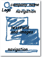
really important. We will place there the logo of the company and on the
right hand side let's place the name.
For a site like this, it is advisable that navigation is clear, in one overview
it has to be clear how the site is structured. This means that the text
and/or icons used for navigation have to be selfexplanatory. If you are
not sure that your whole page will stay within one screen, the navigation
tools can be repeated down at the bottom of the page.
In the centre of the page we will have the information. A golden rule is
not to have too long sentences, organize the information well. When using
images, sound and/or animation, let them be meaningful. Do not use elements
that are only decorative. The sketch of the site for "LovelyMaps"
can be something like this...
In
a later stage we will realize that we will need a more detailed lay-out,
with more exact dimensions, fonts and sizes, etc... But for now this will
do...
|
|