SVG and Geo Web Services for visualization of time series data of flood risk


Abstract


Geoinformatics deals with spatio-temporal data. That means for depicting many datasets it’s important that the temporal or time aspect of that data can be visualised. Animation is an effective way of doing this, and the open standard Scalabe Vector Graphics format (SVG) is suited well for constructing interactive animations, because of its built-in JavaScript language and SMIL animation tools.

The Open Geospatial Consortium’s Web Map Service (WMS) specification is no doubt the most widely implemented of OGC’s Open Standards. It allows output of spatial data in the form of Maps and map like graphics. It’s standardized interface describes mechanisms to request maps of a specific spatial extent , but also of a specific time extent. At present this has been used mostly for extracting static maps of one specific time, or dynamic animation of series of satellite images (in raster animated formats such as animatedGIF). At present no system exist that employs vector data of time series depicted as vector animations.

The goal of our project is to look into the possibility of extending the WMS service with the output of vector time series data as animated, interactive vector maps. This paper will present the outcomes of our research on the standards specifications and the theoretical possibilities, and of our efforts to build a proof-of-concept application using the technologies from the RIMapperWMS project, a WMS application that outputs SVG maps

The test case we use is visualising flood risk models and scenario's. There are many problems in (flood) risk mapping, such as the fact that we deal with fuzzy information (although mostly modelled crisply) and the fact that the information is very time-dependent and time-related. Also there are heterogeneous user groups (ranging from professionals to the general public) whose access to information tools is similarly heterogeneous (from full-blown GIS to only simple web browsers). Some solutions can be found in new IT technology that brings us "Geo-Webservice" based cartography.


Table of Contents

Introduction
Animated mapping
Geo-webservices[1]
From monolithic to distributed GIS architectures
Interoperable webservices
Open Web Services specifications
Time series in WMS
RIMapperWMS: SVG from WMS
SVG animation of Geo-WebServices time-series data
References
Notes

There are many problems in flood risk mapping, such as the fact that we deal with fuzzy information (although mostly modelled crisply) and the fact that the information is very time-dependent and time-related. Also there are heterogeneous user groups (ranging from professionals to the general public) whose access to information tools is similarly heterogeneous (from full-blown GIS to only simple web browsers).

We can approach these challenges from two different angles: Changing theory and technical possibilities in cartography in the recent decades have brought us interactive, animated cartography; Changing IT technology has brought us Geo-Webservice based delivery of cartographic products to the end-users. This paper will look into the possibilities of combining these two recent developments to come up with animating time in Geo-webservices: We will give an outlook on how the technology can allow interactive information on the web (using SVG), that retains links with the underlying data and data models, so that a richer user environment than the ‘traditional’ static web pages can be provided. We will explain what they are and how they differ from traditional GIS, and we will show examples of how these techniques can be used in bringing flood data to the stake holders.

The introduction of computers in cartographic production has greatly expanded the possibilities for mapping. Changing cartography has brought new kinds of maps: We now have not only static maps, but also interactive maps, that can serve as a menu to the underlying data or link us to other data sources, allows to zoom, pan and even change the map design. We can go from the more traditional symbolised and generalised depictions of the world towards more realistic looking virtual worlds or virtual globes. We can combine maps with other graphics, sound and moving images and thus create Multimedia.

Maybe the most revolutionary new possibility is that we can now depict movement and change by using animated or dynamic maps. These allow us to map the time aspect of our data to the display time of our map: By showing a quick succession of slightly different images - usually called frames – a viewer sees an animation of real time. Like the spatial dimension, this time dimension is scaled. There are examples of real-time animations, where any change in reality is reflected 1:1 in the map, and we also can find examples of maps where 200 million years of continental drift are depicted in 20 seconds.


It is not strictly necessary to use dynamic visual stimuli, such as cartographic animations, in order to depict dynamic phenomena. Cartographers have been successfully mapping moving things without animations for centuries. Although the passage of time can not be visualised directly on the two dimensions of a paper map, it can be simulated quite effectively, using either single maps or map series. On single maps we can indicate movement by drawing arrows, or suggest it by drawing lines which indicate the location of phenomena at certain times. By using a series of maps we can give the viewer an impression of the passing of time or some other change from map to map. With these time-series maps it's up to the user to interpolate between the individual maps, thus giving the impression of a smooth development in time.

So it is possible to depict dynamic phenomena using static visual stimuli. Nevertheless, it appears most logical to use dynamic visual stimuli to do so. As early as 1959, Thrower pointed out that cartographers should adapt to the growing possibilities of audio-visual communication. Now that cheap and powerful computers are bringing multi-media to the homes, cartographers are almost forced into using the possibilities to "bring life" to their maps. Although people often think of animation as synonymous with motion, it covers all the changes that have a visual effect. It thus includes the time-varying position (motion dynamics), shape, colour, transparency, structure and texture of an object (update dynamics) and changes in lightning, camera position, orientation and focus and even changes in rendering techniques (Foley et al., 1990). The use of animation for maps, or cartographic animations has been the focus for research for a number of years now. From this research, we know that several types of cartographic animations can be distinguished.

Cartographic theorists have been researching the representation variables in animations. Bertin (1967) did not have much confidence in the usefulness of dynamic maps. He stated that the motion would dominate the graphic variables he distinguished (size, value, grain, colour hue, orientation and shape), thus disturbing the effectiveness of the cartographic message. But then again, Bertin didn't like colour much either... Contrary to Bertin's opinion, recent research has shown that visual variables can indeed be used on the individual frames of an animation in such a way that these images effectively communicate the cartographic message to the user, while the movement of the animation gives the message an extra dimension and "new energy". Furthermore, the findings of Koussoulakou & Kraak (1992) showed that using animated maps helped users grasp the contents of a message in a more effective manner compared to using traditional static maps or map series. It has become clear that the traditional visual variables do not suffice in describing the added means of expression we have in cartographic animations. To this end "new" visual variables have been introduced by DiBiase et al. (1992) and MacEachren (1994). These are called the dynamic visual variables , and they are:

  • duration

  • moment

  • frequency

  • order

  • rate of change

  • synchronisation

The figures below (from Köbben & Yaman, 1995) show examples of the application of these variables.


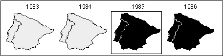
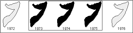
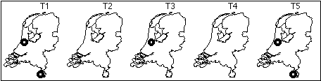
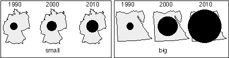
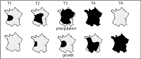
It should be noted that Blok (2005) has concluded that the last two are actually not visual variables on their own, but effects of combining one or more of the others. The dynamic visual variables can only be viewed in display time, and at least one static visual variable is required to be able to see a dynamic variable.

The reason for using dynamic visual variables is that there are many questions that are difficult to answer with static maps, whereas animations can provide answers to such user questions as:

  • when does a predicted flood reach a town?

  • in what order will towns be flooded?

  • how long does it take for the flooding to subside again?

  • how fast does the water move?

  • how often does flooding occur?

  • etcetera...

Answers to such question would be excellently suited for the heterogeneous user groups of our flood risk maps. Cartographic theory therefore seems to offer one side of a possible solution to the problems mentioned in the introduction. But we need a way of automatically generating these animated maps from existing flood risk models and data sets and also a way to deliver the generated animations to the actual users. The Geo-webservices discussed in the next section might be a way forward towards solving that problem.

Interoperable Geo-webservices are the latest in a long line of software for handling geographic, or spatial, information. In 1962, Roger Tomlinson built the Canada Geographic Information System to determine the land capability for rural Canada by mapping information about soils, agriculture, land use, etc. He coined the term GIS for software that is used to gather, visualise and analyse geo-information. Tomlinsons GIS software was running on a large mainframe computer and its architecture was what we call monolithic, with the presentation logic, application logic, and data management layers combined in one software tier. This might still be the typical design for simple desktop applications, but nowadays larger GISs, like other software systems, have their logical layers separated. Separate logical layers improve the interoperability between information systems.

One or more database layers take care of the data storage and retrieval, application layers are used to analyse the information, a mapping engine turns the information into maps, and separate client software gives the actual users access to all of this. The main advantage of such a setup is the flexibility: the different parts can be distributed over various computers and thus can easily be scaled, that is adopted to changing conditions, such as an increasing number of users. Because the client software is separated from the application logic, the same back-end can serve different client platforms (e.g. PCs, PDAs and mobile phones). Equally the data being used in the analysis part can come from various different information sources, from various providers, even from different places on the globe.

Probably the best-known example of such a distributed system approach is the World Wide Web. The WWW consist of many distributed servers that are responding to individual requests of a sheer endless amount of distributed clients. This kind of system is only possible when the different components are guaranteed to work together, because they are interoperable. Interoperability in computer systems means in the first place that the systems are able to transfer data seamlessly. This can be achieved by having the data encoded in a standardised, platform and application independent manner. Nowadays, the popular encoding scheme used for that purpose is the eXtensible Markup Language (XML).

Interoperability also means that two information systems should be able to access distributed functionality in a seamless manner. This would for example mean that one Geographic Information System could use the geoprocessing tools of another GIS. For that to work regardless of operating system, computer platform or software used, we have to specify and set up an infrastructure of interoperable software services. Service-oriented software differs from traditional software in that it fully encapsulates its own functionalities and makes it accessible only via well specified and standardised interfaces. These interfaces publicise the methods that a software component implements, and its calling conventions. In other words, you do not know, nor have to know, how the service actually works, only what input it can receive and what output you can expect back. There are many ways of setting up such Service Oriented Architectures (or SOA’s), but by far the most used distribution platform is the WWW and the SOA’s implemented on that are logically called Webservices.

Web Services are components that can be described, published, located and invoked over the Internet. They are defined as loosely coupled components that communicate via XML-based interfaces. Loosely coupled means that they are independent of computer platform and can be exchanged by similar components, e.g., when one service fails or is too busy, the system can find a similar service elsewhere on the Web. The XML-based interfaces are human readable and self-describing, which allows for automated discovery of their functionality. A simple example of such a webservice is a currency convertor, for example the one at http://www.webservicex.net. If an application (such as the demo form on this web page) is used to send a request to this service, formatted as a standardised XML message:

<FromCurrency>USD</FromCurrency>
<ToCurrency>EUR</ToCurrency>

the service returns a standardised XML response:

<double>0.92635</double>

If webservices have spatial functionality, for example if they use geographic data, can output maps or find routes, we call them Geo-webservices. There are many such Geo-webservices available, the best-know proponent of it probably being Google Maps. This, and other examples such as Yahoo Maps, MSN Virtual Earth or MultiMap, can be used by anybody, as their interfaces are publicly available, but they are still proprietary in the sense that they are defined, developed and owned by commercial companies. Alternatively, Open Standards are created in an open, participatory process, where everyone interested can influence the standard. The resulting specifications are non-proprietary, that is, owned in common. That means free rights of distribution (no royalty or other fee) and a free, public, and open access to interface specifications that are also technology-neutral. There is a set of such well-defined Open Standards for Geo-webservices: the Open Web Services (OWS) of the Open Geospatial Consortium (OGC).

The OGC was founded in 1994 as a not-for-profit, international voluntary consensus standards organisation that develops Open Standards for Geospatial and location based services. Their core mission is to deliver interface specifications that are openly available for global use. The Open Web Services specifications are the basis of many high-profile projects (e.g., the European Community INSPIRE initiative).

There are OWS specifications for most parts of the spatial data storage, analysis and delivery process:

We will use WMS as an example to show the working of OGC specs in a bit more detail. The WMS specification defines four interfaces: GetCapabilities, GetMap, GetLegendGraphic and GetFeatureInfo. The first is used by client software to ask for the capabilities of the service: what layers are available, what projection systems can the maps be delivered in, what output formats can be requested, etcetera. Based on this, the GetMap request is issued to ask for an actual map. Because the client knows the possibilities of the service from the GetCapabilities response, it can issue its request with specific parameters asking for example for a one or more layers of information (LAYERS=borders,forest), in a certain part of the world (BBOX=x1, y1,x2,y2), using a specific projection (SRS=EPSG:4362), et cetera. It will also request that the output is returned in a format that the client can handle (e.g., a web browser will request FORMAT=image/png), and in a specific size (e.g., WIDTH=250&HEIGHT=300). Thus, if you type in the URL

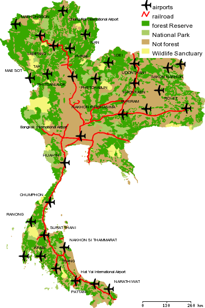
https://kartoweb.itc.nl/cgi-bin/mapserv.exe?map=D:/Inetpub/geoserver/mapserver/config.map&SERVICE=WMS
&VERSION=1.1.1&REQUEST=GetMap&LAYERS=forest,railroad,airports&STYLES=&SRS=EPSG:4326&BBOX=97.35,5.61,105.64,20.47
&WIDTH=400&HEIGHT=600&FORMAT=image/png

in a web browser [try it], the WMS at that site will return the graphic shown below. The GetLegendGraphic request is used in a similar fashion to get a pictorial rendering of a legend item separately. If the user of a mapping client triggers a zoom command, the client will issue a new GetMap request, now with a smaller BBOX. This process will be repeated over and over again while the user interacts with the map.


In WMS services that advertise layers of data as queryable, the GetFeatureInfo request can be used to find attribute values in the underlying data. The client software reports the location of a request in pixel coordinates within the map graphic, and requests the WMS to report on the attribute values of the location in specific layers. The WMS thus has to take into account the size in pixels and in real world coordinates of the graphic it has supplied, plus any re-projections is has done, to calculate the request location in the coordinate space of the original data. It then finds data objects at that location, and does a lookup in the original data store (a vector or raster file, a database, etcetera) to find appropriate data attributes. It then reports these back to the client.

At ITC, we use Geo-webservices in teaching and consultancy. Students and staff build services and clients using a software and data stack that is employing so-called Free and Open Source Solutions for Geospatial (or FOSS4G for short). The Open Source Geospatial Foundation has been created to support and build high-quality open source geospatial software, and many softwares mentioned here are part of that effort and can be seen at the OSGEO website. Spatial data is stored in files, or can be served from spatial databases using PostgreSQL/PostGIS. The OWS services have been built using UMN Mapserver or Geoserver, or our own RIMapperWMS if we want to use SVG output (further details below). As a mapping client one can use free GIS viewers such as uDig or QantumGIS. For web-based solutions (running in any web-browsers), we use Javascript from an open source library called Open-Layers. This is a JavaScript library for displaying map data in most modern web browsers, with no server-side dependencies. OpenLayers implements a JavaScript API for building rich web-based geographic applications. One website that uses this stack is set up to show examples of how Geo-webservices can be used in bringing flood data to the stake holders. Because these stake holders are a heterogeneous user group, ranging from professionals to the general public, their access to information tools is similarly heterogeneous. In order to cater for the lowest common denominator, we set up the webservices to be usable from any web browser. The flood data itself is stored in a raster data store, using the GeoTIFF format. UMN Mapserver software is used to provide Web Map Services. We can combine the WMS providing the flood data with any other WMS for additional layers. And because of the inherent interoperability of the WMS, any other Geo-Webservice could be combined with the flood data, including proprietary ones such as Google Maps.

Although WMS implementations generally render their maps in a raster format such as PNG, GIF or JPEG, a small proportion of them also offer vector-based maps in Scalable Vector Graphics (SVG). However, these implementations all treat the output as just another graphics format, and like the raster output, the maps are basically pictures only, with no interactivity or ‘intelligence’. But SVG is more than a graphics format only, it also offers interactivity, through built-in scripting and full access to its XML DOM. It is therefore possible to build an SVG map, or rather an SVG application, that includes its own GUI, which has been demonstrated in various examples (see e.g. the Carto:Net site). These solutions have been created on a case-to-case basis however, usually as stand-alone applications, and they are not easily generated by or deployed repeatedly from a dynamic set of data. To overcome this, we developed RIMapperWMS, set up to make such a solution more generic, by offering a simple WMS conformant interface to the spatial data that outputs SVG applications. Examples of its use and a detailed description of its setup can be found in Köbben (2007) and on the RIMapper website.

The current version of RIMapperWMS (the first public beta) is fully functional as a Basic WMS 1.1.1 server. It's made available under an Open Source license and we invite anyone interested to experiment with the system, provide us with feedback or further develop the functionality. The example output below shows a map that indicates flood risk in Ward 20 of the city of Kathmandu (Nepal). On mouseover a ‘fuzzy’ risk symbol shows the underlying flood risk data.

Figure 9. Flood Risk in Kathmandu Ward 20.


The next logical step is combining the parts: To have animated maps generated on-the-fly from Geo-webservices. Thus, the animated maps could be SVG graphical applications that offer interactive, high-quality and multi-platform graphics, while retaining access to the underlying data. And because they would be generated on-demand from OWS services, the data (maintained at the source) can be always up-to-date and non-redundant.

The challenge is therefore to find out how we can extend WMS services with output of vector time series data as interactive vector animations using SVG and SMIL. We have done some preliminary research into the relevant OGC specifications and the possibilities of SVG, both in SMIL declarative animations and in Ecmascript based animations. An example of the latter can be found in the test map below: Here the same flood risk data used above is now shown as a series of predicted flood polygons. These are shown in timed sequence by making the appropriate layers (<g> elements in SVG) visible, either by autonomous playback or by interactively moving the time slider. Mouseovers provide tooltips of the underlying attributes, in this case the predicted period of flooding.

Figure 10. First test of animated time series in SVG


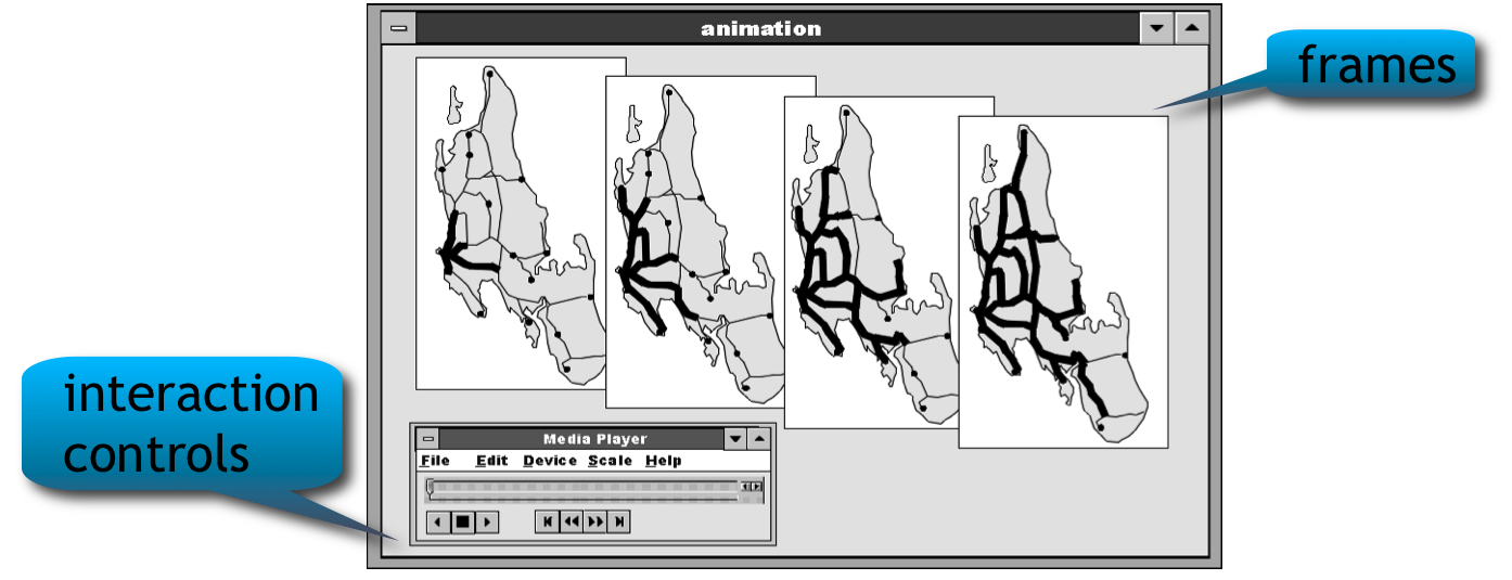
We are currently at this very preliminary conceptual stage, but an MSc student has taken up the challenge of further researching the theoretical possibilities as well as building a real proof-of-concept application. This will be an extension of the RIMapperWMS services and should be based on real use cases. We are looking into several application areas, at ITC we have e.g. data on iceberg movement in the Atlantic and extensive flood-modelling of the “Land van Maas & Waal”, a Dutch river region prone to dike-failures. There will be special attention to the animation interface, and experiment with different types of user interface for the animation control.

Bertin, J. (1967). Semiologie Graphique, Paris/Den Haag: Mouton.

Blok, C.A. (2005). Dynamic visualization variables in animation to support monitoring of spatial phenomena. No. 328 in Nederlandse Geografische Studies, KNAG/Universiteit Utrecht.

DiBiase, D et al. (1992). Animation and the role of map design in scientific visualisation. Cartography and GIS, 19 (1992) 4, pp.201-214.

Foley, J.D. et al. (1990). Computer Graphics: Principles and practice. Reading: Addison-Wesley.

Köbben, B.J. & M. Yaman (1995). Evaluating Visual Variables. In: Proceedings of the Seminar on Teaching Animated Cartography. Madrid/Utrecht: International Cartographic Association, pp. 45-53.

Köbben, B.J. (2007). RIMapperWMS: a Web Map Service providing SVG maps with a built-in client. In The European Information Society - Leading the way with Geo-information (S. Fabrikant and M. Wachowicz, eds.), Lecture Notes in Geoinformation and Cartography, pp. 217–230, Berlin, etc.: Springer-Verlag.

Koussoulakou, A. & M.J. Kraak (1992). Spatio-temporal maps and cartographic communication. The Cartographic Journal, 29 (1992) 2, pp. 101-108.

MacEachren, A.M. (1994). How maps work: Issues in representation & design. New York: Guildford Press.

Thrower, N.J.W. (1959). Animated Cartography. The professional geographer, 11 (1959) 6, pp. 9-12.

[1] - this section is based on the unpublished lecture note "A short introduction to Geo-webservices", used at the International Institute for Geo-Information Science and Earth Observation (ITC). This in turn is based on the teaching materials (slides, exercises) for various modules on WebGIS, Webmapping, Spatial Data Infrastructures and the like, developed by Rob Lemmens, Andreas Wytzisk and Barend Köbben.