Table of Contents
Cartography and geographic information systems deal with phenomena occurring at the surface of the Earth. These phenomena are usually represented in a static way despite the fact that many of them are dynamic in nature. Examples of such dynamic phenomena are: the changes in concentration of a given gas in the air, the movements of animals intheir environment or the drift and deformation of tectonic plates. Among the techniques to visually analyze this dynamism, interactive animated mapping has been pointed out as the only one to be generically applicable [Andrienko].
Two types of animated maps can be distinguished, based on the type of data which is depicted: raster animated maps and vector animated maps. The objective of this research is to provide better possibilities to produce and to disseminate vector animated maps. Nowadays, the most used means to disseminate animated maps is the internet. However, no existing software facilitates the automated production of vector animated maps directly from temporal data, in a Open Standard format suitable for internet dissemination. We therefore looked into solutions to fill this gap.
The foundation for animated maps is spatio-temporal data. To make it convenient for users to build their animated maps, as well as for data interoperability, it is important for the system to make use of a widely accepted format in the way it stores time. The Open Geospatial Consortium (OGC) recommends specific ways to store the spatial dimension of information as well as its temporal component.
The front end or the visible part of vector animated maps is animated vector shapes. At the time of our research, two graphical formats could be used to produce vector animations for the internet: Adobe Flash and Scalable Vector Graphics (SVG). SVG was chosen over its competitor for the following reasons: Its specification allows developers to use SMIL (Synchronized Multimedia Integration Language), a declarative XML-based language well suited for building data driven animations; It is recommended by both the W3C and the OGC; The needs of cartographers are taken into account by SVG developers; And finally it is an Open Standard, where Flash is a proprietary technology.
The practical objective of this research was therefore to develop an animated mapping system which would generate SVG SMIL animations from spatio-temporal data stored according to OGC’s recommendations. To go about this task we extended the capacity of RIMapperWMS, an existing system which produces SVG static maps from a non-temporal OGC-compliant spatial database [Kobben].
The scope of vector animated mapping is broad and we therefore started by developing a prototype system for one specific type of phenomenon: the movement of objects in geographic space. As a test-case, we planned to visualize the dynamics underlying the calving and movement of icebergs. The data used is the American National Ice Center’s Antarctic icebergs dataset http://www.natice.noaa.gov/products/iceberg.
To design the system, a number of questions needed to be answered: Firstly, on the database side, we needed to determine how to store the data for it to comply with the relevant OGC standards. Secondly, we needed to choose which types of SVG SMIL animation types we would use to represent the real-world dynamics. Thirdly, we needed to develop algorithms for converting the temporal component of the data from database format to display format. Fourthly, based on animated mapping literature and our experiments, we needed to determine what user-interface elements and what interactive mechanisms should be offered to the user. Finally an appropriate architecture for the overall system needed to be designed.
In the next section, we will provide the reader with an overview of the system developed, answer the questions posed above and document the development of the system’s components. We cannot cover all the aspects of this research. Because this paper is written for the SVG Open Conference, we will look at our work from a developer’s point of view and will therefore primarily illustrate the data storage and data conversion questions as well as the development of animations and interactive functions. The present paper is based on a Master of Science thesis [Becker], completed at the International Institute for Geo-Information Science and Earth Observation (ITC).
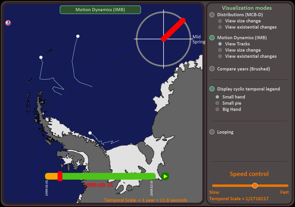
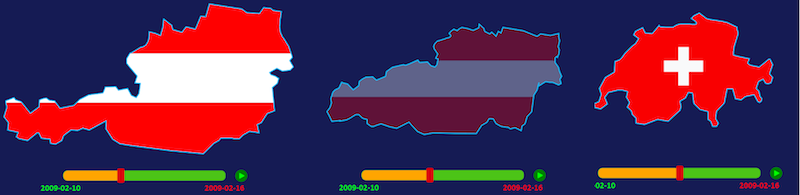
The current version of the TimeMapper prototype is now specialized for moving-objects visualization. Figure 1 shows the prototype presenting three icebergs in Antarctica. The system functions in the following way: it retrieves spatio-temporal data from the database and generates interactive animated maps showing the movement of the objects.
OGC’s Web Map Server Implementation Specification [OGCWMS] introduces the way to store temporal data. It adopts the ISO 8601 standard, which recommends storing time stamps in one single string. Up to 14 digits specify century, year, month, day, hour, minute, seconds, and optionally a decimal point followed by zero or more digits for fractional seconds, with non-numeric characters to separate each piece. All times should be expressed in Coordinated Universal Time (UTC) as indicated by the suffix Z (for "zulu"):
ccyy-mm-ddThh:mm:ss.sssZ
2009-10-04T14:50:58Z
= October 4th 2009 at 2:50 pm and 58 seconds
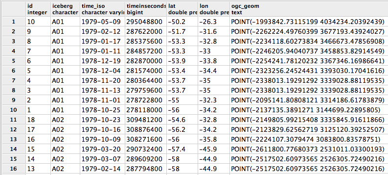
We designed our database to comply with this specification. Figure 2 shows example
tuples of our icebergs database table. The function of the column timeinseconds
will be explained later.
In geographic theories on change, three main types of change are usually recognized: existential change (e.g. appearance/disappearance), change of spatial properties (e.g. location, shape) and change in attribute (e.g. land-cover change). The traditional partition of geographic data into polygons, lines and points are the objects on which these changes occur. In the present test-case, we mainly focused on changes in position and existential change for point objects.
To show the movement of our objects, two main types of animations were used, stepwise animations and linearly interpolated animations. Such animations are easy to generate using SVG SMIL. The following code shows an example of an animation for the movement of a circle element, depicting iceberg A22B:
<circle id="IB_A22B" cx="0" cy="600" r="25" >
  <animate id="XanimIB_A22B_0" attributeName="cx" repeatCount="none" fill="freeze" begin="0s"
   from="0" to="200" dur="2s" calcmode="discrete" />
  <animate id="YanimIB_A22B_0" attributeName="cy" repeatCount="none" fill="freeze" begin="0s"
   from="600" to="550" dur="2s" calcmode="discrete" />
</circle>
The first animate element will lead to movement along the x-axis and the
second on the y-axis. The begin attribute tells the animation when to start and
the dur attribute sets its duration and therefore its apparent speed. The
calcMode attribute is set to “discrete”, which means we will see a stepwise
animation. In brief, the effect of these two animations is that the object is going to jump
from 0 to 200 on the x-axis and from 600 to 550 on the y-axis after a period of 2 seconds.
For a linearly interpolated animation, the calcMode attribute would have been
set to “linear”.
In our moving-object prototype, the interpolated animation type is offered to the users
for them to be able to appreciate the movement of the objects taken individually or in small
groups. In other words, we are interested in the dynamics of the
trajectories. To help visualize this, we add animated tracks. SVG SMIL doesn’t have a
built-in way of animating growing line segments. However, members of the SVG community have
developed a workaround by animating the stroke-dasharray attribute of
lines.
Animations to render existential changes were also developed for our test-case. The
visual effect desired is to have the objects appear/disappear at the display-time
corresponding to the real-world time that they “appear/disappear” in the dataset. To achieve
this, we use the set animation on the attribute visibility in the
following way:
<set id="ShowAnimIB_A22B" attributeName="visibility" begin="0.94" from="hidden" to="visible"/>
In the two previous subsections, we first saw the way that the data is stored in the database and then, how time is used in SMIL animations. We now need to find an algorithm to go from real-world time in the database to display time in the animations. Three steps effectuate the necessary conversion. These three steps are illustrated in Figure 3.
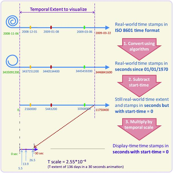
The first step is to Convert the ISO 8601 time stamps to a single unit time format. For
this, we converted the ISO 8601time_iso strings to a timeinseconds
value, i.e. number of seconds since a fixed staring point. This starting point is arbitrary,
we use the so-called epoch (1/1/1970), because Java(script) as well as
SQL use this in their Date functions.
The second step is necessary for the animations to start at the right time. The first animations will generally start soon after the beginning of the time extent chosen by the user, which in display-time is the time 0. To achieve this, we subtract the start-time value from all time-stamps.
If the animations were viewed at this stage, they would last as long as the real-world events. For geological data for instance, this could last for hundreds of millions of years! The third step is therefore to multiply all time-stamps by a ratio that we call the temporal scale. Just as in traditional cartographic spaial scale (the ratio between map distances and real-world distances), in animated cartography the temporal scale of an animation is the ratio between display-time and real-world time [HarFab]. Most often, in geographic studies, time will be shrunk for the viewer to visualize in a short time the events which happened during a comparatively long period.
Most animated mapping theorists agree that the user should be aided in his visualization task by two elements: temporal legends and ways to interact with the temporal dimension of the maps.
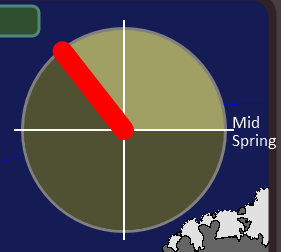
Kraak and others [KraakEdsall] state that temporal legends are useful to “understand a temporal animation” because they help him to “apply an appropriate temporal schema” thus allowing him “to interpret meaning inherent in the sequence and pacing of the animation.” Three main types of temporal legends exist: digital clocks, time bars and cyclic temporal legends. All three of these legend types were developed. Regarding the cyclic temporal legend, we chose to develop three different versions with the intention of testing their cognitive effectiveness.
Coding the three types of temporal legends was done using different methods. The time-bar and two versions of the cyclic temporal legend were developed using simple SMIL animations (linear in the first case and cyclic in the second). To develop the cyclic legend that we call “small pie” (see figure 4), a total of five animation elements were necessary.
The digital clock was built in the following manner: a JavaScript function is run
which retrieves the animated value (animVal) of the time-bar temporal legend.
This value is processed in a way which includes graphical parameters as well as the
temporal scale parameter. The value resulting from this process is the real-world time (in
seconds) corresponding to the instant being displayed. This value is transformed into a
JavaScript Date object and time elements, such as years, months, etc., are
further concatenated in a string which is injected in the text element of the
clock. The function is run a few times per second which makes the clock run.
Two main categories of interactive functionalities were developed: those meant for choosing the visualization options and those meant to control the temporal dimension of the animations.
The first category enables the user to choose between stepwise and interpolated
animations, to add or remove interpolated tracks, to include the cyclic temporal legend
and to choose which cyclic legend to view (if any). The mechanism behind these interactive
choices is a series of Javascripts changing the attributes of SVG elements that have been
retrieved through a getElementById call.
The second category comprises four interactive playback functions: a play/pause function, a time slider, a looping function and a slider to control the speed of the animations. The principles of these functionalities are well known to users familiar with movie software and need not be explained. In brief, these functionalities were developed as follows:
The play/pause function makes use of the SVG functions
pauseAnimations()and its oppositeunpauseAnimations().The time slider is embedded within the time-bar temporal legend. When the user clicks or moves the slider, the value of the slider is injected into the function
setCurrentTime()thus dynamically setting the time of all animations.The looping function makes use of a different type of mechanism: within the
animateelement of the time-bar, we include anonend()attribute which resets the time of all animations to 0.The speed-slider is a functionality which is central to the whole system. The only available way to change the speed of an animation for current browser implementations is to change the temporal attributes of all
animateelements (i.e.,beginanddurattributes). When the user interacts with the slider, he is actually setting the value of the temporal scale of the animations. This scale is then used to recalculate the value of thebeginanddurattributes. In addition, the values of the time slider itself also need to be reset accordingly.
A fifth interactive feature would be necessary for the system to be complete: a way for the user to choose the temporal extent he wishes to visualize.
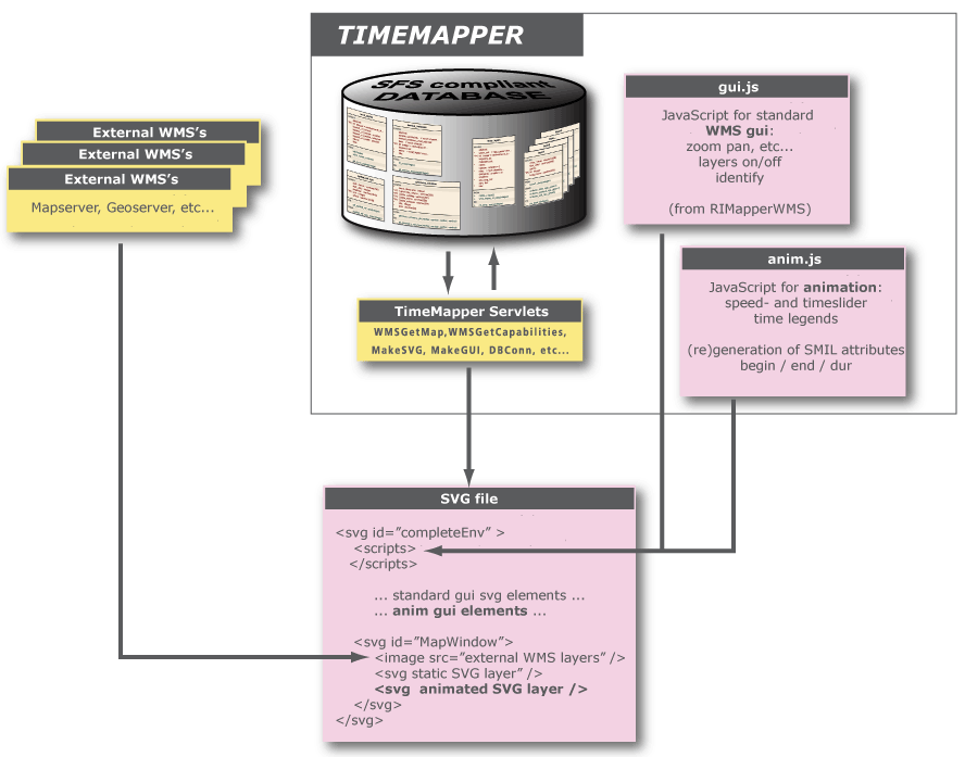
The system’s architecture is presented in figure 5. A spatial database back-end is used
for storing both the configuration of the Web Map Services as well as the actual spatial and
attribute data the maps are derived from. A template SVG file defines the setup of the GUI:
the necessary scripts for the basic WMS GUI as well as the animation GUI are loaded, and the
map layers are defined as a set of nested SVG elements. The content of the map
layers is not limited to animated SVG. External WMS layers can also be included, for
instance in the example in Figure 1, “The TimeMapper prototype showing the movement of three icebergs in
Antarctica.”, the land and ice-shelf are (raster)
layers from the Antarctic Cryosphere Access Portal OGC services
(http://nsidc.org/agdc/acap). Additonally, one or more non-animated SVG
layers can be retrieved from the TimeMapper system.
The application tier is a set of Java Servlets that can be deployed in any J2EE
compatible servlet container (eg. Apache Tomcat). The servlets do recurring tasks like
extracting OGC features and attribute data from the database, translating these into
fragments of SVG and ECMAscript, collecting and structuring these fragments into valid
output and delivering this output to the clients. The interfaces to the servlets complies to
OGC's Web Map Service standard: GetCapabilities, returning an XML description
of the WMS’s information content and acceptable request parameters and GetMap,
returning the map itself.
In this section we will describe how the system functions and what preliminary visualization results we were able to get on our icebergs use case. Finally, we will try and assess how well the system could be extended to visualize other dynamic phenomena and other types of geographic data.
We will first describe how the system functions from a user perspective. For this, the reader may refer to Figure 1, “The TimeMapper prototype showing the movement of three icebergs in Antarctica.” for a screenshot of the system. The first choice a user needs to make regards the type of animations he desires to visualize. He can choose stepwise animations, which are convenient to study distributions, or linear interpolated animations, which, especially when adding interpolated tracks, are effective to visualize movement dynamics (trajectories, speeds and comparing the behaviors of a few icebergs).
The second choice the user needs to make is to set the speed of the animations. The speed is set with the speed control slider which actually sets the temporal scale of the animated map. The speed shall be set for the objects to move at convenient speeds to observe the behavior under study. Other choices the user can make are displaying optional temporal legends (cyclic and digital) and choosing the looping visualization mode or not.
These choices will determine what the user will see in the map display as well as the behavior of the animations. The display shows the temporal legends and the animated objects. When the animation is played, the dynamic items start running and the user can interact with the moment of the animations by clicking and dragging the time slider.
In addition, the spatial GUI of the original RIMapper system has been integrated, and can be accessed by clicking the small "?" icon. Here, one can switch layer visibility, retrieve data attributes. Also the user can pan or zoom the map, at which point a new WMS request is sent to the server(s) and new animations are compiled for the spatial bounding box now to be visualized.
For testing purposes, a series of three test-cases have been generated with an increasing number of icebergs displayed. The first, or “small” test-case has three icebergs. The second, or “middle” test-case, has nineteen icebergs (all the icebergs present in the Weddell Sea region during the five years visualized). The third, or “big” test-case, shows 99 icebergs (all icebergs in the Antarctic Ocean during the five years visualized). For the moment, testing has only been done using the Opera web browser.
While testing the prototype with the small test-case, we assert that all the features function as planned. The speed setting system as well as the time-slider work particularly well. Thanks to a third degree polynomial equation, the speed-slider can be set with satisfactory modularity. Without this equation, moving the slider a given distance could double the speed in low speeds (temporal scale from 1/1,000 to 1/2,000) or have no effect at all in high speeds (1/9,500,000 to 1/9,501,000). With this small test-case, the time-slider is very responsive. The user can interact with the temporal moment of the animation with hardly any response delay.
However, with larger test-cases, there are important responsiveness limitations, that
mostly affect the speed-setting mechanism and the time-slider. Setting the speed of the
animations with the middle test-case takes a few seconds. Interacting with the time slider
with this test-case still works but is too slow to constitute a usable exploratory tool.
This is due to the fact that the rendering engine of the browser needs to calculate the
positions of many objects. At the present stage of development, each segment travelled by an
object leads to two animations (one x and one y) and it may be that the rendering goes
through all these animations even if they are not relevant to the moment of the animation
being shown. We plan to do some testing using a different coding method for the animation,
using keyTimes/values. With this method, the whole trajectory travelled by one
object would lead to only two animations and this may improve the responsiveness of the
animations to the time slider. This change might also improve the responsiveness of the
speed-setting mechanism drastically.
Finally, the big test-case takes a very long time to load. Setting the speed of the
animations and interacting with time with the time slider hardly works at all. As seen
above, re-coding the animations with the keyTimes/values method might improve
the responsiveness of the speed-setting mechanism. However, we predict that it wouldn’t have
enough effect on the time slider’s responsiveness. For that, other performance enhancements
might be necessary.
Our experimentations with our test-cases showed that different iceberg behaviors can be visualized depending on two visualization parameters: the number of icebergs and the type of animation used.
While viewing a small number of icebergs with interpolated animations and interpolated animated tracks, the user can effectively study the relative movement dynamics of the icebergs. In other words, he can observe and compare the directions and speeds of the few icebergs viewed. In addition, we found that the time slider helped the user grasp these movement characteristics. To the contrary, the behaviors observed here are much harder to observe using the stepwise animations.
When the user visualizes more icebergs (middle or big test-case), simple stepwise animations are effectively used to show moving clusters of icebergs. Seasonal variations in the number of bergs calving from the ice-shelf can also be detected and the cyclic temporal legends are helpful in this regard. More testing would need to be done and ways to emphasize the calvings might be helpful.
The iceberg use case also gave us reasons to begin testing other animation types. For instance, to emphasize the moment of calvings, we started experimenting with the use of blinking animations and changes of color. We also started experimenting with animations to show the changes in size of the icebergs. In effect, our dataset includes attributes about the lengths of the sides and areas of icebergs. These three types of animation would be of use in a more complete animated mapping system and the testing we did shows that they respond well to our interactive controls.
A more advanced type of animation is the polygon-morphing. We developed a test-case by re-using an animation developed by the carto.net team, which shows the morphing of a polygon into another. The test-case also includes supplementary animations affecting the opacity of fills. Screen captures of this animation can be seen in figure 6. This test-case is particularly interesting because morph animations could be argued to be the most complex type. They could be useful in the showing of floods or tectonic-plate deformations. This animation was successfully integrated into the TimeMapper environment and the different interactive functionalities work very well. The time slider in particular works without any lag! This is a promising result for developing a system offering all types of animations that could be useful in animated cartography.
We can conclude firstly that OGC’s standard for the storage of spatio-temporal data was successfully combined with SVG SMIL animations to produce an animated mapping prototype system for the visualization of moving objects. A use case for the visualization of the movements of Antarctic icebergs was developed and our test-cases show that the system behaves as planned. Different visualization modes and parameters (type of animation, number of icebergs, types of temporal legends and speed of the animations) enable users to observe different behaviors and detect different spatio-temporal patterns such as moving clusters (when many objects are observed) and movement characteristics such as direction and speed (when few objects are observed).
The time slider, which is considered to be the central interactive device, enables users to powerfully navigate the temporal dimension of the animations when few objects are displayed. However, the responsiveness of this slider is less good with more numerous objects and can even become unuseable for really large numbers. We have identified possible solutions to improve this responsiveness as well as less problematic delays (in the setting of the speed), but they still need to be tested.
The positive results, as well as promising experiments with other types of animations and objects, make us hopeful that the TimeMapper system could be extended into a complete animated mapping system. The results of the planned improvements will determine the number of objects (or animations) that will constitute the limit for the use of a time slider.
The first item on our recommendation list is, as already stated, attempting to improve the responsiveness of the time slider when dealing with many objects. Our best chance to improve this responsiveness is to use a more compact way to code the animations. The delays of the speed setting mechanisms are likely to get solved at the same time.
Whether the responsiveness is improved or not, we intend to do further experiments with the icebergs dataset. To carry out these experiments, in addition to being able to zoom and pan the map, it would be convenient for the user to have a simple way of selecting the icebergs he desires to visualize as well as the time extent.
To prove that the set of technologies we used can serve for developing a more complete animated mapping system, we propose to develop test-cases for different types of phenomena. For instance, it would be interesting to see how well the system could be used to animate census data (i.e., the evolution of income in a group of regions over a period of time).
An important source of temporal georeferenced data is satellite imagery. Unless this data is processed, it comes in raster formats. SVG is not only a vector graphics format: raster images can easily be embedded and manipulated within it. Many fields make use of both vector and raster spatio-temporal data. In our icebergs use case for instance, it might be of interest for researches to view the movement of icebergs at the same time as the evolution of the concentration of sea-ice in the ocean (raster temporal data). Our recommendation is therefore to look into the possibilities of integrating temporal series of raster images within the current, mainly vector based, animated mapping prototype.
[Andrienko] 2006. Springer Verlag. Exploratory analysis of spatial and temporal data : a systematic approach.
[Becker] 2009. ITC MSc Thesis. Visualizing Time Series Data Using Web Map Service Time Dimension and SVG Interactive Animation.
[Kobben] 2007. “RIMapperWMS: a Web Map Service providing SVG maps with a built-in client”. 217-230. The European Information Society - Leading the way with Geo-information (Lecture Notes in Geoinformation and Cartography). Springer Verlag. 3-540-72384-6. Sara Fabrikant et al..
[HarFab] 2008. “The role of map animation for geographic visualization”. 44–66. Geographic Visualization: Concepts, Tools and Applications. John Wiley and Sons. M. Dodge et al..